Color and Type for the Crookston Campus
From Ph.D. hoods to athletic uniforms, color has been used for centuries to indicate affiliation with a university—it's an essential part of our institutional identity. The official colors of the University of Minnesota are maroon and gold.
Questions on colors and type: contact Amber Bailey or Kelsey Engelstad
Colors: Print and Web
To promote the University's brand, use maroon and gold as the predominant colors in designs for print and the Web. The Golden Eagle logo uses the same gold and the one-color option can be printed in maroon, gold, black or white as well.
Print Colors
| UNCOATED PAPER | Pantone | CMYK |
|---|---|---|
| Gold | Pantone 116U | 0, 16, 100, 0 |
| Maroon | Pantone 201U | 0, 100, 63, 29 |
| COATED PAPER | Pantone | CYMK |
|---|---|---|
| Gold | Pantone 136C | 0, 27, 76, 0 |
| Maroon | Pantone 202C | 0, 100, 61, 43 |
Web Colors
| WEB COLORS | RGB | HEX |
|---|---|---|
| Gold | R:255 G:204 B:51 | #FFCC33 |
| Maroon | R:122 G:0 B:25 | #7A0019 |
Complimentary Approved Colors and Tints
to Accent Maroon and Gold
| Color | HEX | CMYK |
|---|---|---|
| Light Maroon* | #900021 | 0, 100, 77, 44 |
| Light Gold* | #FFDE7A | 0, 13, 52, 0 |
| Darker Gray* | #333333 | 0, 0, 0, 80 |
| Medium Gray* | #777677 | 0, 1, 0, 53 |
| Light Gray* | #D5D6D2 | 0, 0, 2, 16 |
| Lighter Gray* | #F0EFEE | 0, 0, 1, 6 |
| Off White* | #F9F7F6 | 0, 1, 1, 2 |
Academic Department Colors
The UMN Crookston's four academic departments utilize the traditionally accepted colors of each department's primary discipline. Graduates' tassels are of the corresponding color at commencement ceremonies. The color is also used to signify the departments on banners hung above the commencement stage. Departments may choose to use these colors in other related projects.
| Department | Color | Pantone |
|---|---|---|
| Agriculture & Natural Resources | Maize | Pantone 600C |
| Business | Drab | Pantone P32-9U |
| Humanities, Social Sciences & Education | White | Pantone White |
| Math, Science & Technology | Gold | Pantone 15-0955TCX |
Print Typography
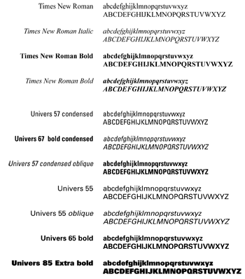
Like color, consistent use of typography helps ensure that we're speaking with one voice. The University's suggested fonts are Frutiger, Helvetica Neue, Hoefler, Neutraface and Times New Roman, and Univers for print materials.
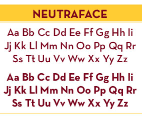
Recommended Headline Font: Neutraface
The headline font used across the University of Minnesota system is Neutraface, the Driven to Discover brand typeface. It is recommended for use as a headline font.
For Easy Readability
- Use a 10-point type size or larger.
- Limit your use of type treatments (such as bold type, italics and underlining) to three treatments or fewer per publication.
- Use type size to clearly distinguish between headlines, subheads and body copy, and apply those elements consistently.
- Select a headline font that is a sans-serif, such as:
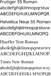
- Neutraface
- Univers
- Frutiger
- Helvetica Neue
- Select a body font that is a serif, such as:
- Hoefler Text Roman
- Times New Roman
The following are suggested print fonts:
Univers and Times New Roman are the approved font families for all print materials. Additional typefaces may be used is rare instances when necessary to place emphasis or convey an intended message.